How to Format a Novel
Formatting or designing your novel can be unnerving. All bestseller novels and the classics that we love are easy on the eyes and easy to read. And first impressions count. Publishers and your readers will form an impression of their own of your story and book at first glance. But fret not. The bulk of your attention and time can remain on crafting your story and other creative aspects of your novel. For industry-standard or professional formatting, or to ensure that your novel is polished and presentable, you need not have extensive technical expertise in formatting or designing.
For your book to get published and thereafter picked up by people, formatting and design that is inviting and readable are crucial. Some basic formatting guidelines include choosing and standardizing font sizes and types, using readable line-spacing, including page numbering for your readers to follow, and so on. Along with these, this article will take you through formatting guidelines that you can look into while writing your manuscript and novel, for it to ready to be distributed to publishers and readers.

The Importance of Formatting your Manuscript or Novel
While working on your manuscript, or the preliminary draft of your novel, you would definitely be focusing your energy and time on the more creative aspects of your story development and writing. While some choose to format their work and they move along their writing, some may find it more convenient to format everything in it's entirety after completing the manuscript.
No matter at which stage you choose to format your work, once you've reached the juncture of being ready to present it to other people; be it publishers, agents, editors, or advisors, it is vital that it adheres specific formatting standards. Formatting can be a tedious process, and can seem secondary to your story. But formatting your manuscript allows for unhindered readability and is a deciding factor in your work being taken taken seriously.
Paying attention to industry-standard formatting is a crucial indicator of you being precise and careful with your work, and reflects professionalism in the way you choose to present your writing. This puts faith in the people you approach with your work, and your future readers. Sending your work out to editors with standardized formatting expedites the revision and proofreading processes in the later stages as well.
Formatting Elements for Manuscripts
1) Appropriate margins
You may feel the need to input as much text as you can on a single page to keep your page numbers as minimal as possible. But tight margins affect readability and can be intimidating to readers. In multiple types of binded manuscripts or books, your text can disappear into the inside edge as well, and readers will find themselves forcefully prying the book open just to be able to read. To avoid this, include one-inch margins all around the sides; top, bottom, right and left sides of your book.
2) Readable fonts
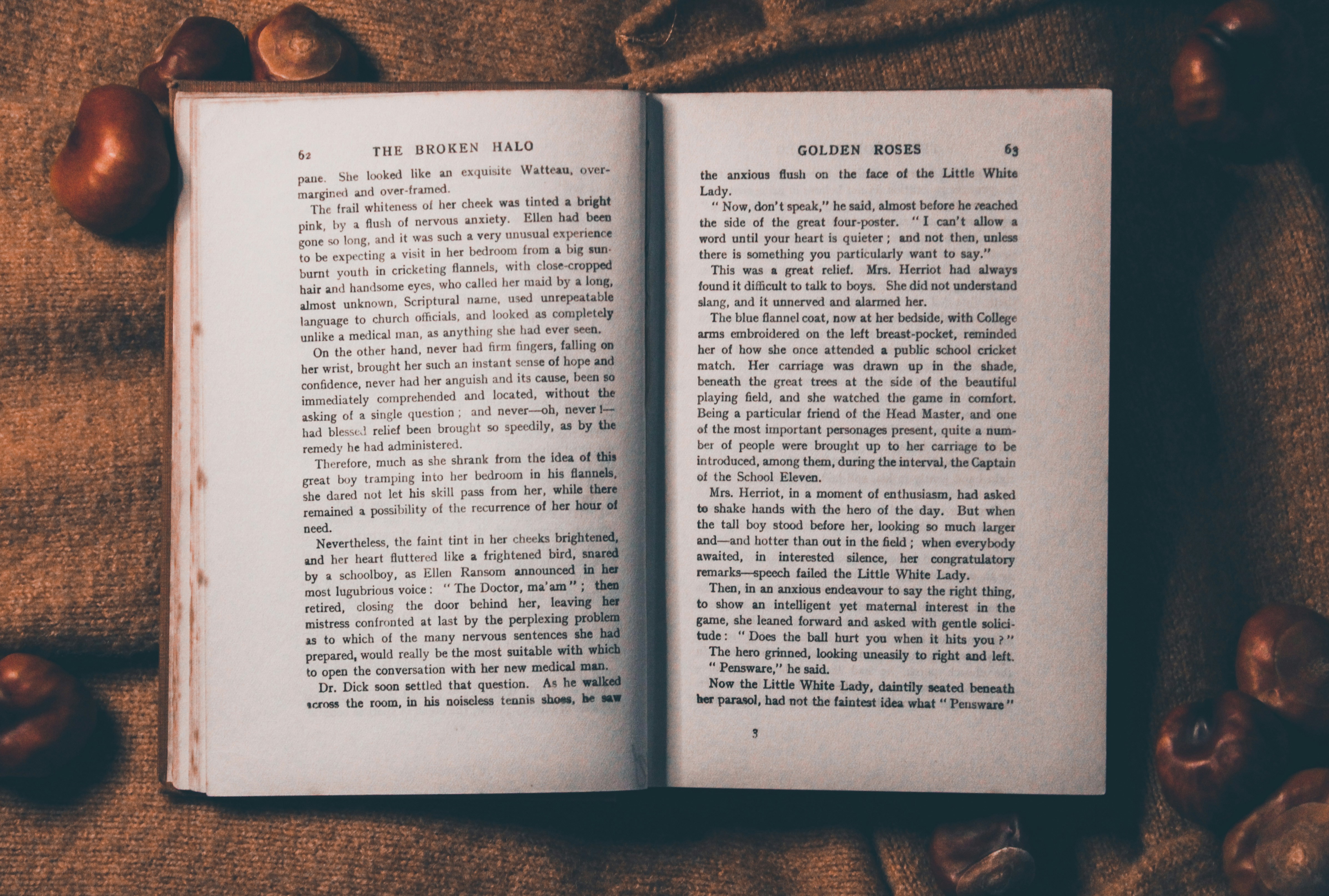
Industry-standard formatting for books is understood to be Times New Roman, in size 12. This font, along with a few others, is a typeface that that is pleasing to the eyes and readable even after a hundred pages.
Most book are set with a font size of 12, but this is not a rule set in stone. Different typefaces can reflect slightly varying sizes because of different letter shapes. To manage this, you can work towards having 10–15 words per line, despite the typeface you choose.
If you would like to venture out into other fonts, stick to typefaces with a uniformed and even look, where there is minimal contrast between the thicker and thinner lines in the letters. Outside of your main body text, you can experiment with more abstract fonts for your cover and title pages and chapter titles.

3) Leading space
Leading, or your line-spacing, is the distance from the very bottom of a line to the bottom of the next. Double-spacing your manuscript makes it easier to both read and mark-up.
4) Alignment
Align your text to the left-hand side of the page. The right-hand will be remain unjustified. This follows the way in which we read; from left to right. The left side being uniformed makes it easier to follow and read
5) Indentation
Readers can get lost in your text after reading for an extended period of time. Identifying new paragraphs is made easy by indenting the very first line of a fresh paragraph. This indent is about a quarter of an inch long. will usually do the trick. While some choose to separate paragraphs with an empty line, this is more appropriate for reading text on a screen.

6) Headers
The headers in your novel is positions at the top of each page, right before the first line of your main text. In manuscripts, they should reflect the author's last name at the left, the title of the book centered, and the page number towards the right.
7) Chapters
Each new chapter should start on a fresh page, with the chapter title centered midway or one-third down the page.
Formatting Elements for Novels
The sections in a novel can be briefly classified in the "front matter" (sections that come before your story), your main or principal text, and "back matters" (sections that follow your story). The formatting elements included in a novel are as follows :
1) Title page
The information stated on a title page of books does not follow hard and fast rules; what's included can vary from book to book. But it is certain that evert book should have an opening a title page. Some of the information you should include here consist of :
- Author’s name
- Title of book
- Subtitle, if any
- The publisher's name
- Year of publication
- Dedication information, if any
2) Cover
Your cover is the very first thing your readers will lay their eyes upon. It is also the very first thing that should capture their attention enough for them to flip open your book. Physically, the book cover is also a protective cover for pages. The title of your book and the author's full name are the crucial information that are displayed on the cover.

3) Dedication
Some authors choose to include a dedication page if they feel like expressing their gratitude towards people who have influenced their writing or helped with the publishing process. This section is entirely optional.
4) Content page
The contents page is a chapter breakdown for readers. It appears in the order in which the chapters follow in the book.. Often in a table format, the page lists the page on which a specific chapter or section begins, along with its title.
5) Foreword
Included in the beginning of a book, the foreword or preface is a introductory section that can give readers insight into how the story was crafted. While these terms are often used synonymously, a foreword is normally found in nonfiction works, while a preface is included in fictional works instead.
6) Main text or body
Following the "front matter" or your book, the main text is essentially your story and what makes up the predominance of your book. Unquestionably thee longest section of your novel, this is where your story comes through.

7) Epilogue
The epilogue, often a concluding chapter, serves as a commemorating comment or wrap-up to what happens in your book. It can used to simply wrap up any possible loose ends in your story, reveal information about the fates of your characters. or even as a hint at a possible continuation in the next book.
8) Glossary
The glossary, or a book’s personal dictionary is a section that you can use to define and expand upon more unfamiliar and intricate, or even made-up words in your book.
Formatting a novel acrroding to industry standard guidelines and into these discrete sections is an arduous task. JotterPad's novel template addresses this need by providing a template for writers to use, build upon, or customize according to their writing and novel needs. The template allows writers to have a visual representation of how their story can look like together with the formatting they need at anytime they would like. The template's pre-determined fields and sections makes it all the more easier for writers to concentrate on the meat of their writing instead.
You have undoubtedly invested time and effort into crafting your story and putting your novel together. Your effort should be reflected in the way your novel looks as well. Your formatting and design, be it for your preliminary manuscript or finalized book, should facilitate your readers' experiencing and reading your story.